Trading 101: How To Read The Market Using Lagging Indicators
In the context of technical analysis and investment, lagging indicators refer to certain technical indicators that follow or lag behind price movements and trends in the financial markets. These indicators are derived from historical price data and provide insights into past market behavior. They are often used to confirm the direction of a trend or to provide signals after a trend has already established itself.
Lagging indicators in the realm of technical analysis are used to confirm the strength and sustainability of price movements. They are not designed to predict future price movements, but rather to provide information about the current state of the market.
Lagging indicators work by analyzing historical price data and providing insights into past market behavior. They are derived from the same price data that traders and analysts use to plot price charts and identify trends. These indicators are called “lagging” because they react to price movements that have already occurred. Here’s how they generally work:
Data Collection: Lagging indicators use historical price data to calculate their values. This data is typically collected over a specific period, such as a certain number of days or periods.
Calculation: Lagging indicators employ mathematical formulas to process the historical price data and generate a value or a series of values. These formulas vary based on the specific indicator being used. For example, moving averages calculate the average price over a certain number of periods.
Plotting on Charts: Once the calculations are complete, the values of lagging indicators are plotted on price charts, alongside the actual price data. This allows traders and analysts to visualize the relationship between the indicator and the price movements.
Confirmation of Trends: Lagging indicators are used to confirm trends that have already been established. For example, a moving average might show whether the price is currently above or below its historical average, indicating an uptrend or downtrend.
Signal Generation: Lagging indicators can generate buy or sell signals based on certain conditions. These conditions are often related to the relationship between the indicator and the price data. For instance, when a short-term moving average crosses above a long-term moving average, it might generate a buy signal.
Timing and Confirmation: Lagging indicators can be particularly useful for confirming the strength and sustainability of trends. Traders use them to avoid making decisions solely based on short-term price fluctuations and instead focus on more established trends.
Applications of Lagging Indicators in Technical Analysis
Lagging indicators in the realm of technical analysis are used to confirm the strength and sustainability of price movements. They are not designed to predict future price movements, but rather to provide information about the current state of the market. Some common examples of lagging indicators in technical analysis are discussed below.
Moving Averages
Moving averages are one of the most common lagging indicators. They smooth out price data over a specific period of time, allowing traders to identify trends more easily. Simple Moving Averages (SMA) and Exponential Moving Averages (EMA) are commonly used variations.
a. Simple Moving Averages (SMA):
A Simple Moving Average is calculated by summing up the closing prices of an asset over a specific number of periods (such as days, hours, or weeks) and then dividing the sum by the number of periods. The result is a single value that represents the average price over that time frame. As new price data comes in, the oldest data is dropped from the calculation, and the average is recalculated.
Blue line indicates the SMA calculated over a 20 day time period.
SMA serves to smooth out price noise and highlight underlying trends. Traders use it to identify support and resistance levels, potential trend reversals, and general market direction. Longer periods for the SMA provide a broader view of the trend, while shorter periods offer more sensitivity to recent price movements.
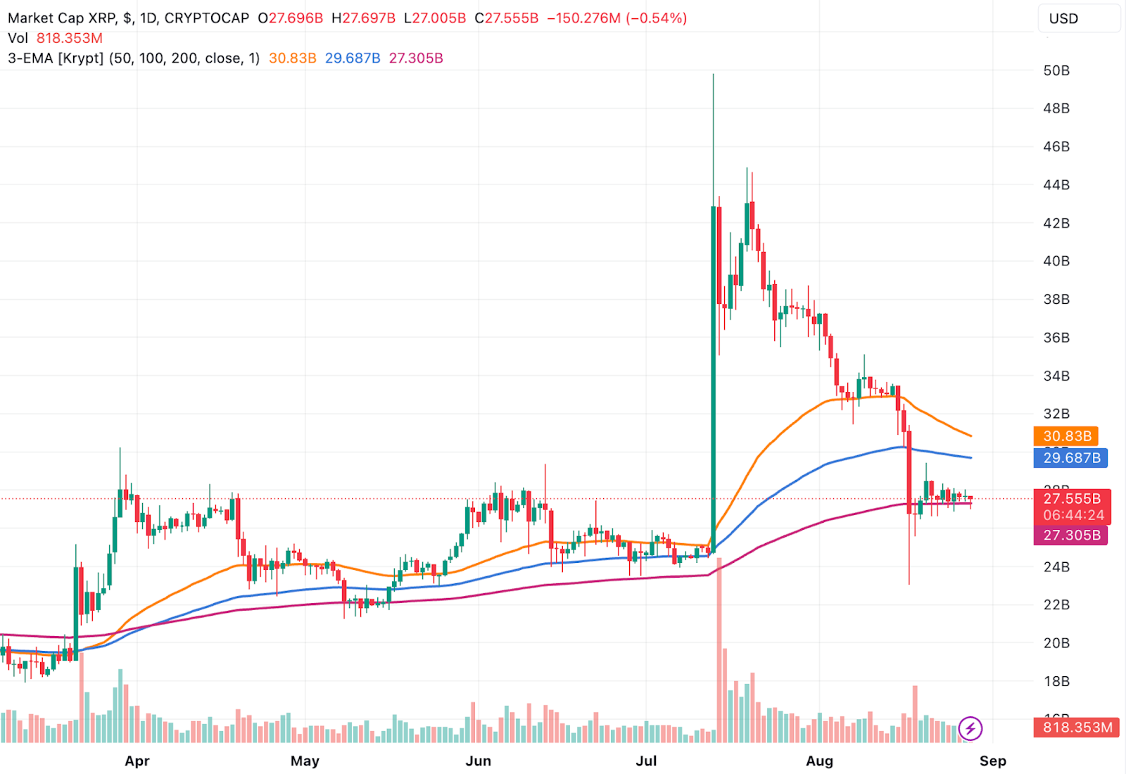
b. Exponential Moving Averages (EMA):
Exponential Moving Averages place more weight on recent price data compared to older data. This is achieved by using a weighted average calculation, with more significance given to recent prices. EMAs react more quickly to price changes, making them particularly useful for capturing short-term trends and potential trend reversals.
The orange line indicates the EMA over 50 Candles, the blue over 100 Candles and the red over 200 Candles.
EMA is especially popular among traders seeking to identify entry and exit points within fast-moving markets. It responds swiftly to rapid price shifts, aiding in timely decision-making. However, this responsiveness can also make EMAs more susceptible to noise or false signals.
Both SMA and EMA are versatile tools in technical analysis, offering a visual representation of price trends that can guide trading strategies. They help identify whether an asset is in an uptrend, downtrend, or range-bound movement. Crossovers between different moving averages, such as the intersection of a short-term EMA with a longer-term SMA, can generate buy or sell signals.
MACD (Moving Average Convergence Divergence)
MACD is a trend-following momentum indicator that consists of two moving averages. It helps traders identify changes in trend momentum and potential buy/sell signals.
The MACD line, formed by subtracting the 26-period Exponential Moving Average (EMA) from the 12-period EMA, represents the difference between these moving averages. Meanwhile, the signal line, typically a 9-period EMA of the MACD line, smooths its trajectory to offer a clearer depiction of its trend direction.
The blue line indicates the MACD and the orange line is the signal line.
The interplay between the MACD line and the signal line bears significance in evaluating trend momentum. A MACD line crossing above the signal line yields a bullish signal, hinting at a potential shift from downtrend to uptrend and signaling a possible entry point. Conversely, a MACD line crossing below the signal line signals bearish momentum and a potential transition from uptrend to downtrend, possibly indicating an opportunity to sell.
The accompanying histogram, which reflects the difference between the MACD line and the signal line, further complements the analysis by highlighting the strength of momentum. Moreover, the MACD’s concept of convergence and divergence assists in interpreting market conditions: convergence aligns the MACD line and asset price movement, validating the trend’s robustness, while divergence hints at potential trend reversals when these elements move in opposing directions.
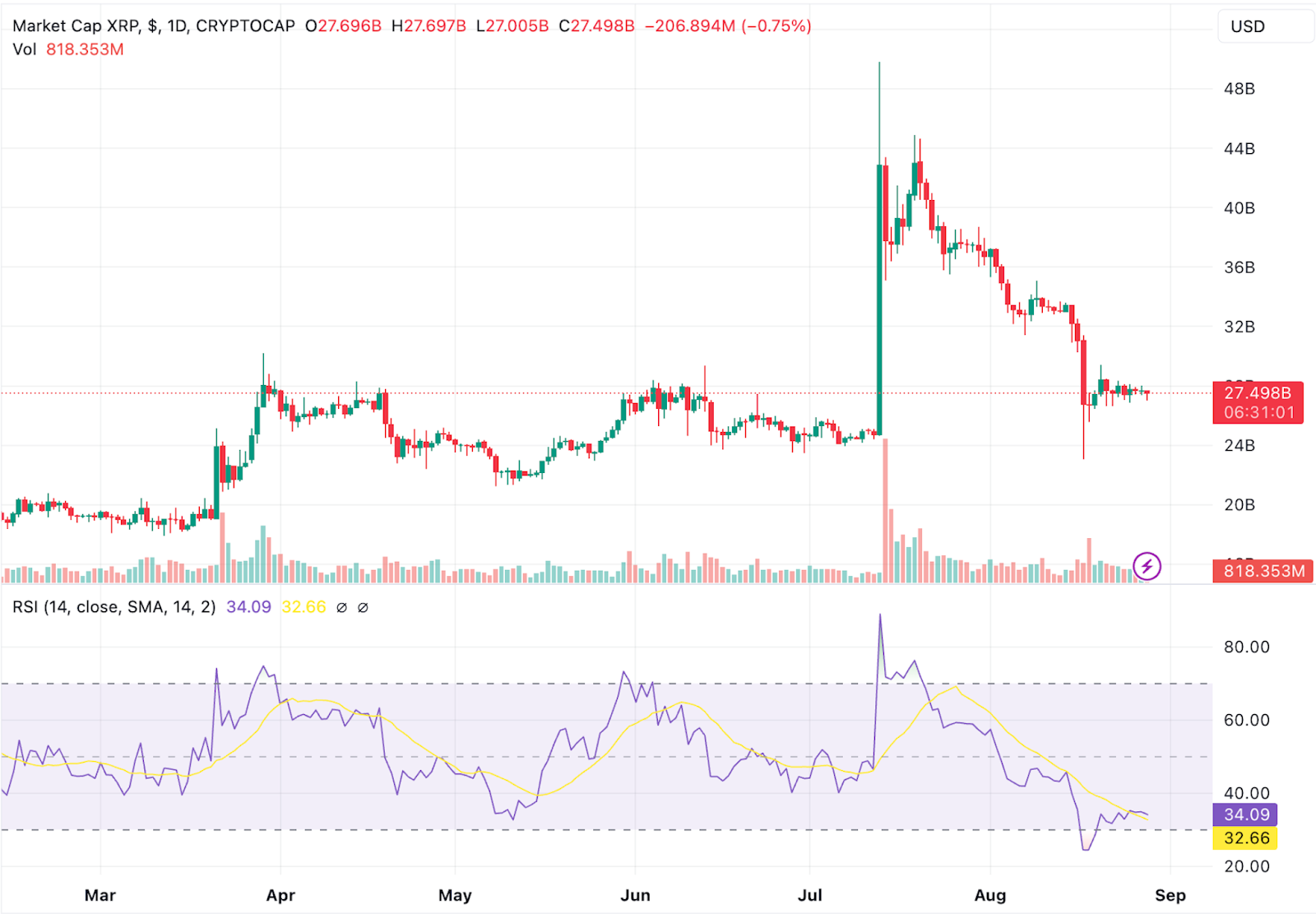
RSI (Relative Strength Index)
RSI measures the magnitude of recent price changes to evaluate overbought or oversold conditions. It provides signals when an asset’s price has moved significantly in one direction.
The RSI is calculated using a formula that takes into account the magnitude of recent price changes over a specified number of periods. This value is then used to create a scale that ranges from 0 to 100. Generally, an RSI value above 70 is considered indicative of an overbought condition, suggesting that the asset’s price may have risen too rapidly and could be due for a corrective pullback. Conversely, an RSI value below 30 is often seen as signaling an oversold condition, implying that the asset’s price may have dropped excessively and could be poised for a potential rebound.
The purple line indicates the RSI, whilst the shaded area indicates the 30-70 zone. The yellow line indicates the RSI based moving average.
The RSI’s potential for generating buy and sell signals is a hallmark of its utility. When the RSI crosses above the overbought threshold (70) after being below it, or when it crosses below the oversold threshold (30) after being above it, traders interpret these crossovers as potential signals for price reversals.
The RSI also plays a role in confirming trends. When the RSI’s direction aligns with the trend direction, it validates the trend’s strength. Conversely, when a divergence occurs, wherein the RSI’s direction contradicts the trend’s direction, it could suggest a weakening trend and potential impending reversal.
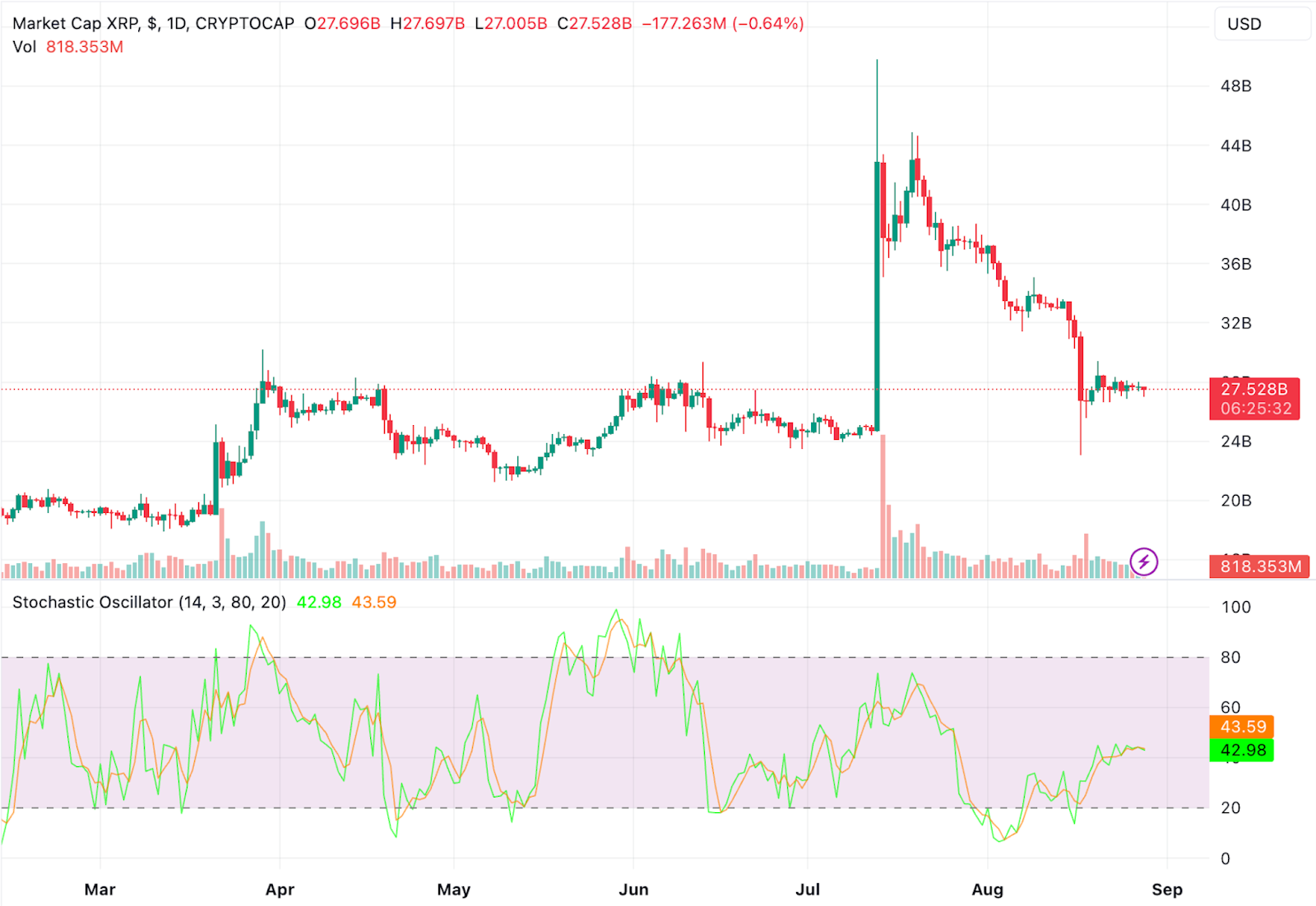
Stochastic Oscillator
This indicator compares an asset’s closing price to its price range over a specific period. It helps identify potential reversal points by indicating overbought or oversold conditions.
The Stochastic Oscillator is calculated by comparing an asset’s most recent closing price to the range between its highest high and lowest low over a predetermined period. The result is then transformed into a percentage scale that ranges from 0 to 100. When the Stochastic value approaches the upper range (typically above 80), it suggests an overbought condition, signifying that the asset’s price may have surged excessively and could be ripe for a potential downward correction. Conversely, a Stochastic value nearing the lower range (usually below 20) signifies an oversold condition, implying that the asset’s price may have declined significantly and could be due for a possible upward rebound.
The green line indicates %K and the orange line indicates %D. The shaded area indicates the 20-80 zone.
One of the primary strengths of the Stochastic Oscillator lies in its ability to reveal potential reversal points. When the Stochastic lines, known as %K and %D, cross over each other or diverge from the asset’s price movements, they can offer insights into potential changes in market direction. A bullish reversal signal occurs when the %K line crosses above the %D line in the oversold region, indicating a potential upward price shift. Conversely, a bearish reversal signal emerges when the %K line crosses below the %D line in the overbought region, potentially indicating an impending downward correction.
Bollinger Bands
Bollinger Bands consist of a moving average and two standard deviation bands. They help traders identify potential price volatility and reversals. They are constructed around a central moving average, typically a Simple Moving Average (SMA) of a specified period. The standard deviation of price data from this moving average is calculated, and two bands are created—one above the moving average (upper band) and one below it (lower band). The width of these bands varies with market volatility; when volatility increases, the bands widen, and when volatility decreases, they contract.
The Bollinger Bands are indicated in blue, the shaded area between the bands is an indicator of volatility.
The primary function of Bollinger Bands lies in assessing price volatility and potential ranges. In periods of high volatility, the bands expand, signifying increased market uncertainty and potential significant price movements. Conversely, during periods of low volatility, the bands narrow, indicating reduced market turbulence and potentially limited price range.
Bollinger Bands are not only insightful in gauging volatility but also in identifying potential price reversals and trends. Price movements that extend beyond the upper or lower bands could signal an overbought or oversold condition, suggesting a potential reversal in the near future. Traders often view such situations as opportunities to enter or exit positions.
The “squeeze” is a phenomenon observed when the bands contract significantly, indicating low volatility periods. This often precedes a period of increased price volatility and potential breakouts. Traders watch for the squeeze as it may lead to significant price movements.
ADX (Average Directional Index)
ADX measures the strength of a trend and can help traders determine if a trend is strong enough to be traded. The ADX is calculated through a series of steps. It first computes the Plus Directional Movement (+DM) and Minus Directional Movement (-DM) based on price movements. These directional movements are then smoothed using an Exponential Moving Average (EMA) to derive the Plus Directional Indicator (+DI) and Minus Directional Indicator (-DI). The ADX is finally calculated based on the ratio of the absolute difference between the +DI and -DI, divided by their sum and multiplied by 100.
The red line indicates the ADX.
The ADX value itself is presented on a scale ranging from 0 to 100. The higher the ADX value, the stronger the trend. When the ADX is below 20, it generally suggests a weak trend or a range-bound market. As the ADX surpasses the 20 threshold, it indicates an increasing trend strength. An ADX reading above 40 often signifies a robust trend. Traders commonly use the 20 and 40 levels as reference points to identify the strength of a trend and assess its viability for trading.
The ADX’s utility lies in its ability to guide traders in their decision-making process. When the ADX value is low, traders might avoid initiating new positions, as the market might lack a clear direction. On the other hand, a rising ADX indicates the development of a stronger trend, which can serve as an opportune moment to consider entering or adding to existing positions. The ADX does not offer directionality itself; instead, it focuses solely on the strength of the trend.
Additional Applications of Lagging Indicators
In addition to their common use in technical analysis and investment, lagging indicators have various other applications in different fields. The following are just some examples.
Economic Analysis: Lagging economic indicators, such as GDP, unemployment rates, and inflation rates, are used by economists and policymakers to assess the overall health and performance of an economy. These indicators help analyze past economic trends and guide policy decisions.
Business Performance Evaluation: Companies use lagging indicators like revenue, profit margins, and customer satisfaction scores to evaluate their historical performance. These metrics provide insights into the outcomes of past business strategies and decisions.
Quality Control: In manufacturing, lagging indicators like the number of defective products or customer complaints are used to assess product quality and identify areas that need improvement.
Limitations of lagging indicators
It’s important to note that lagging indicators have limitations. Since they rely on past price data, they might not be effective in rapidly changing markets or during periods of high volatility. Additionally, lagging indicators might provide signals after a significant portion of a trend has already occurred, potentially leading to delayed entries or exits.
To overcome these limitations, traders often use lagging indicators in combination with leading indicators (which provide insights into potential future trends) and other technical and fundamental analysis tools. This holistic approach can help traders make more informed and well-rounded trading decisions.
Conclusion
In the intricate landscape of technical analysis and investment, lagging indicators serve as indispensable guides for traders and analysts. These indicators, derived from historical price data, shed light on past market behavior, confirming trends and providing crucial signals. The depth of their applications extends beyond trading strategies, encompassing economic analysis, business evaluation, and quality control.
Lagging indicators, including moving averages, MACD, RSI, Bollinger Bands, and ADX, offer insightful perspectives on market dynamics. Moving averages, both simple and exponential, smooth out noise and provide a clear view of trends, aiding traders in identifying entry and exit points. MACD deciphers trend momentum and generates signals, while RSI signals overbought and oversold conditions, indicating potential reversals. Bollinger Bands excel in assessing price volatility and reversals, with their “squeeze” heralding impending breakout opportunities. ADX, the trend strength metric, empowers traders to gauge the robustness of trends, guiding decisions.
However, these lagging indicators are not without limitations. Their retrospective nature may lead to delayed signals, especially in rapidly changing markets. To overcome this, traders often integrate lagging indicators with leading indicators and a holistic toolkit of technical and fundamental analysis. This synergy empowers them to make well-informed decisions, ensuring a comprehensive understanding of market dynamics.
We use cookies on our website to give you the most relevant experience by remembering your preferences and repeat visits. By clicking “Accept All”, you consent to the use of ALL the cookies. However, you may visit "Cookie Settings" to provide a controlled consent.
This website uses cookies to improve your experience while you navigate through the website. Out of these, the cookies that are categorized as necessary are stored on your browser as they are essential for the working of basic functionalities of the website. We also use third-party cookies that help us analyze and understand how you use this website. These cookies will be stored in your browser only with your consent. You also have the option to opt-out of these cookies. But opting out of some of these cookies may affect your browsing experience.
Necessary cookies are absolutely essential for the website to function properly. These cookies ensure basic functionalities and security features of the website, anonymously.
Cookie
Duration
Description
cookielawinfo-checkbox-analytics
11 months
This cookie is set by GDPR Cookie Consent plugin. The cookie is used to store the user consent for the cookies in the category "Analytics".
cookielawinfo-checkbox-functional
11 months
The cookie is set by GDPR cookie consent to record the user consent for the cookies in the category "Functional".
cookielawinfo-checkbox-necessary
11 months
This cookie is set by GDPR Cookie Consent plugin. The cookies is used to store the user consent for the cookies in the category "Necessary".
cookielawinfo-checkbox-others
11 months
This cookie is set by GDPR Cookie Consent plugin. The cookie is used to store the user consent for the cookies in the category "Other.
cookielawinfo-checkbox-performance
11 months
This cookie is set by GDPR Cookie Consent plugin. The cookie is used to store the user consent for the cookies in the category "Performance".
viewed_cookie_policy
11 months
The cookie is set by the GDPR Cookie Consent plugin and is used to store whether or not user has consented to the use of cookies. It does not store any personal data.
Functional cookies help to perform certain functionalities like sharing the content of the website on social media platforms, collect feedbacks, and other third-party features.
Performance cookies are used to understand and analyze the key performance indexes of the website which helps in delivering a better user experience for the visitors.
Analytical cookies are used to understand how visitors interact with the website. These cookies help provide information on metrics the number of visitors, bounce rate, traffic source, etc.
Advertisement cookies are used to provide visitors with relevant ads and marketing campaigns. These cookies track visitors across websites and collect information to provide customized ads.